Analysis
|The following commands rely heavily on the matplotlib (DOI:10.5281/zenodo.2577644) and seaborn (DOI:10.5281/zenodo.883859) libraries, but have been modified in many cases for ease of plotting given the formatting of xpressplot datasets.
Formatting Notes
Sample Color Palette
A dictionary of experiment groups with corresponding RGB values for colors (use of common color names is not currently tested)
Examples:
sample_colors = {'Adenocarcinoma': (0.5725490196078431, 0.5843137254901961, 0.5686274509803921),
              'Adenoma': (0.8705882352941177, 0.5607843137254902, 0.0196078431372549),
              'Normal': (0.00784313725490196, 0.6196078431372549, 0.45098039215686275)}
Single-gene Analysis
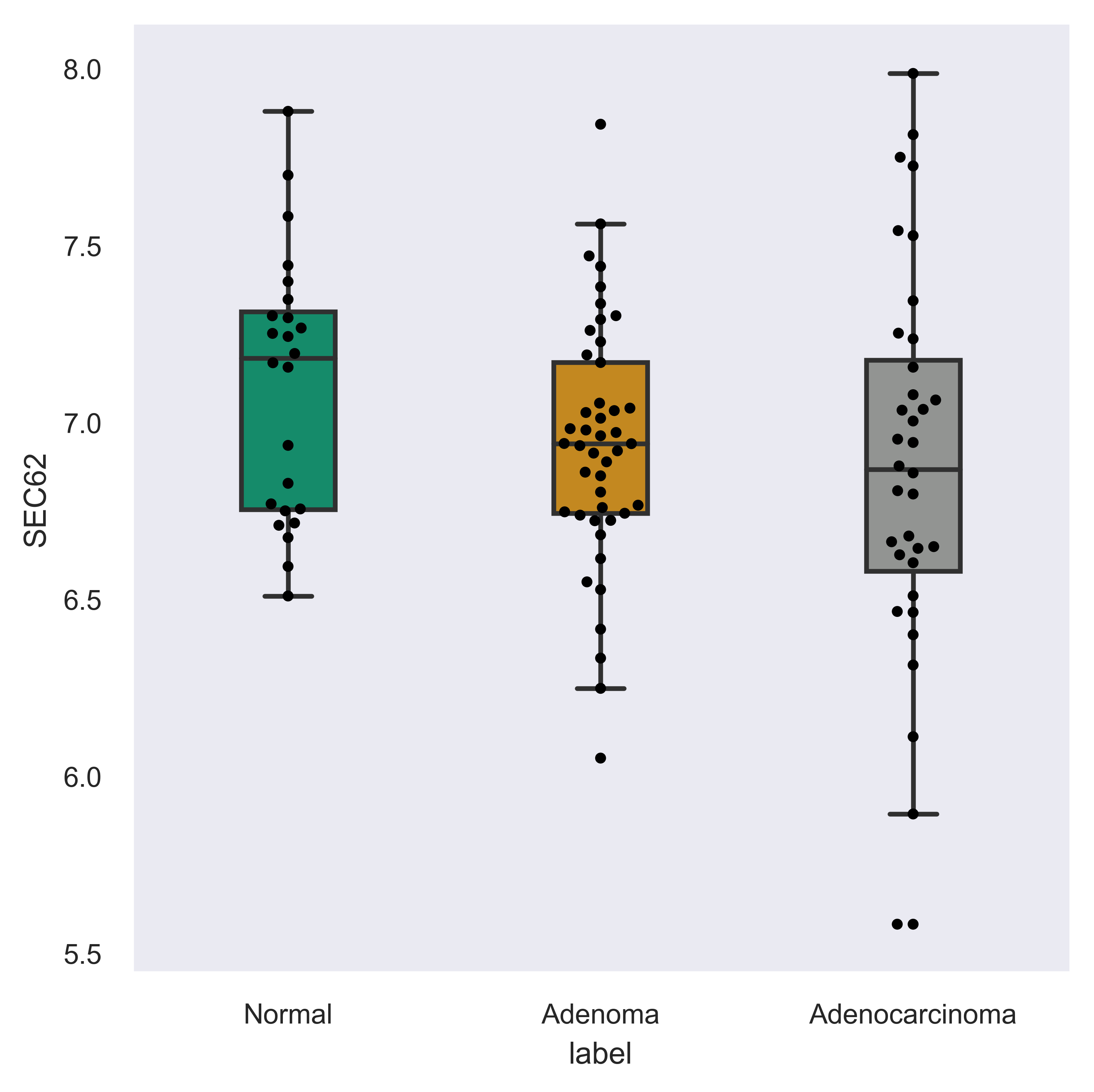
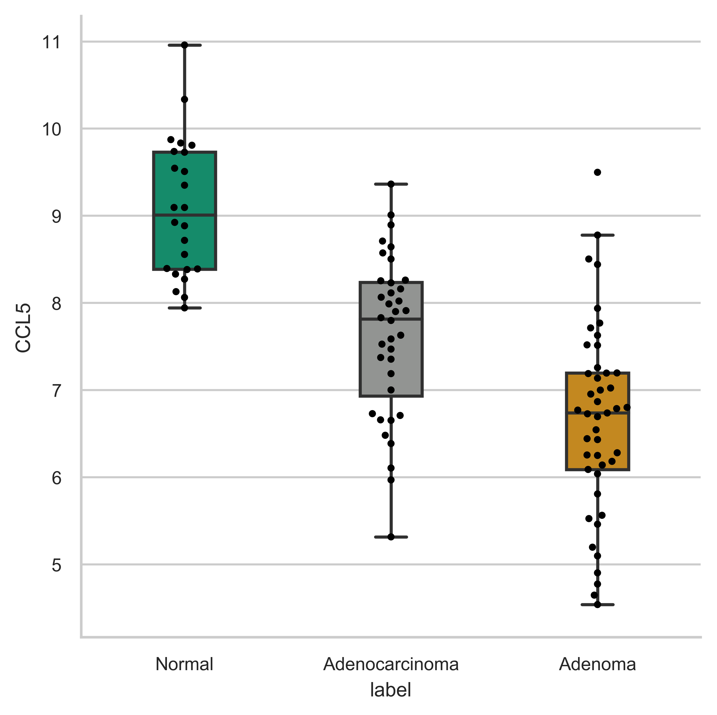
xpressplot.gene_overview ( data, info, gene_name, palette, order=None, grid=False, whitegrid=False, save_fig=None, dpi=600, bbox_inches=’tight’ )
Purpose:
Create a boxplot with overlaid swarmplot for each experiment group for a particular gene
Assumptions:
- Dataframe and metadata are properly formatted for use with xpressplot
Parameters:
data: xpressplot-formatted dataframe (Required)
info: xpressplot formatted sample info dataframe (Required)
gene_name: Name of gene to plot (Required)
palette: Dictionary of matplotlib compatible colors for samples (Required)
order: List of experiment groups in order to plot (Default: None)
grid: Set to True to add gridlines (default: False)
whitegrid: Set to True to create white background in figure (default: Grey-scale)
save_fig: Full file path, name, and extension for file output (default: None)
dpi: Set DPI for figure output (default: 600)
bbox_inches: Matplotlib bbox_inches argument (default: ‘tight’; useful for saving images and preventing text cut-off)
Examples:
>>> xp.gene_overview(data, metadata, gene_name='SEC62', palette=sample_colors,
    order=['Normal','Adenoma','Adenocarcinoma'])
>>> xp.gene_overview(data, metadata, 'CCL5', sample_colors, grid=True, whitegrid=True)
Multi-gene Analysis
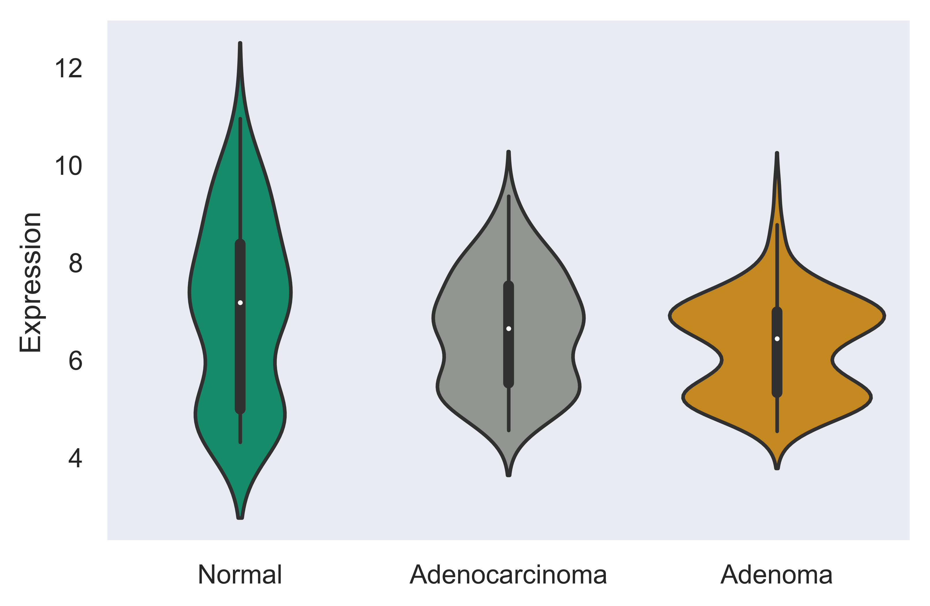
xpressplot.multigene_overview ( data, info, palette=None, gene_list=None, order=None, scale=None, title=None, grid=False, whitegrid=False, save_fig=None, dpi=600, bbox_inches=’tight’ )
Purpose:
Create violin plots of a subset of gene expressions or total gene expression by experiment group
Assumptions:
- Dataframe and metadata are properly formatted for use with xpressplot
Parameters:
data: xpressplot-formatted dataframe (Required)
info: xpressplot formatted sample info dataframe (Required)
palette: Dictionary of matplotlib compatible colors for samples (Default: None)
gene_list: List of genes to plot (default: None; plots total gene expression for experiment group)
order: List of experiment groups in order to plot (Default: None)
scale: Seaborn violinplot scale argument (default: ‘area’)
title: Plot title (default: None)
grid: Set to True to add gridlines (default: False)
whitegrid: Set to True to create white background in figure (default: Grey-scale)
save_fig: Full file path, name, and extension for file output (default: None)
dpi: Set DPI for figure output (default: 600)
bbox_inches: Matplotlib bbox_inches argument (default: ‘tight’; useful for saving images and preventing text cut-off)
Examples:
>>> xp.multigene_overview(data, metadata, palette=sample_colors,
    gene_list=['SEC62','CCL5','STX6'])
>>> xp.gene_overview(data, metadata, palette=sample_colors, gene_list=['STX6'],
    order=['Normal','Adenoma','Adenocarcinoma'])
Heatmap
xpressplot.heatmap ( data, info, sample_palette=None, gene_info=None, gene_palette=None, gene_list=None, col_cluster=True, row_cluster=False, metric=’euclidean’, method=’centroid’, font_scale=0.8, cmap=jakes_cmap, center=0, xticklabels=True, yticklabels=True, linewidths=0, linecolor=’#DCDCDC’, cbar_kws=None, figsize=(16,6.5), save_fig=None, dpi=600, bbox_inches=’tight’ )
Purpose:
Create clustered heatmaps for gene expression dataframe
Assumptions:
- Dataframe and metadata are properly formatted for use with xpressplot
Parameters:
data: xpressplot-formatted dataframe (Required)
info: xpressplot formatted sample info dataframe (Required)
sample_palette: Dictionary of matplotlib compatible colors for samples (Default: None)
gene_info: xpressplot formatted metadata matrix for genes (column0) and gene groups (column1)
gene_palette: Dictionary of labels and colors for plotting, or valid seaborns clustermap col_colors option
gene_list: List of genes to plot (default: None; plots total gene expression for experiment group)
col_cluster: Cluster columns/samples (default: True)
row_cluster: Cluster rows/genes (default: False)
metric: Seaborn clustermap argument (default: ‘euclidean’)
method: Seaborn clustermap argument (default: ‘centroid’)
font_scale: Aspect by which to scale text (default: 0.8)
cmap: Matplotlib colorbar valid entry (default: jakes_cmap; a color-blind friendly color palette)
center: Value at which to center the color scale (default: 0)
xticklabels: Include x-axis labels (default: True)
yticklabels: Include y-axis labels (default: True)
linewidths: Thickness of grid lines (default: 0; no grid-lines printed)
linecolor: Grid line color (default: ‘#DCDCDC’; or white)
cbar_kw: Matplotlib colorbar additional arguments (default: None)
figsize: Figure size tuple; width, height (default: (16,6.5))
save_fig: Full file path, name, and extension for file output (default: None)
dpi: Set DPI for figure output (default: 600)
bbox_inches: Matplotlib bbox_inches argument (default: ‘tight’; useful for saving images and preventing text cut-off)
Examples:
>>> xp.heatmap(data, metadata, sample_palette=sample_colors, gene_list=['SEC62','STX6','CCL5'],
    cbar_kws={'label':'z-score'}, figsize=(20,2))
>>> xp.heatmap(data, metadata, sample_palette=sample_colors, gene_palette=gene_colors,
    gene_info=gene_metadata, gene_list=['SEC62','STX6','CCL5'], figsize=(20,2),
    row_cluster=True)
>>> xp.heatmap(data, metadata, sample_palette=sample_colors, xticklabels=True, linewidths=.5,
    linecolor='black', gene_list=['SEC62','STX6','CCL5'], figsize=(20,2))

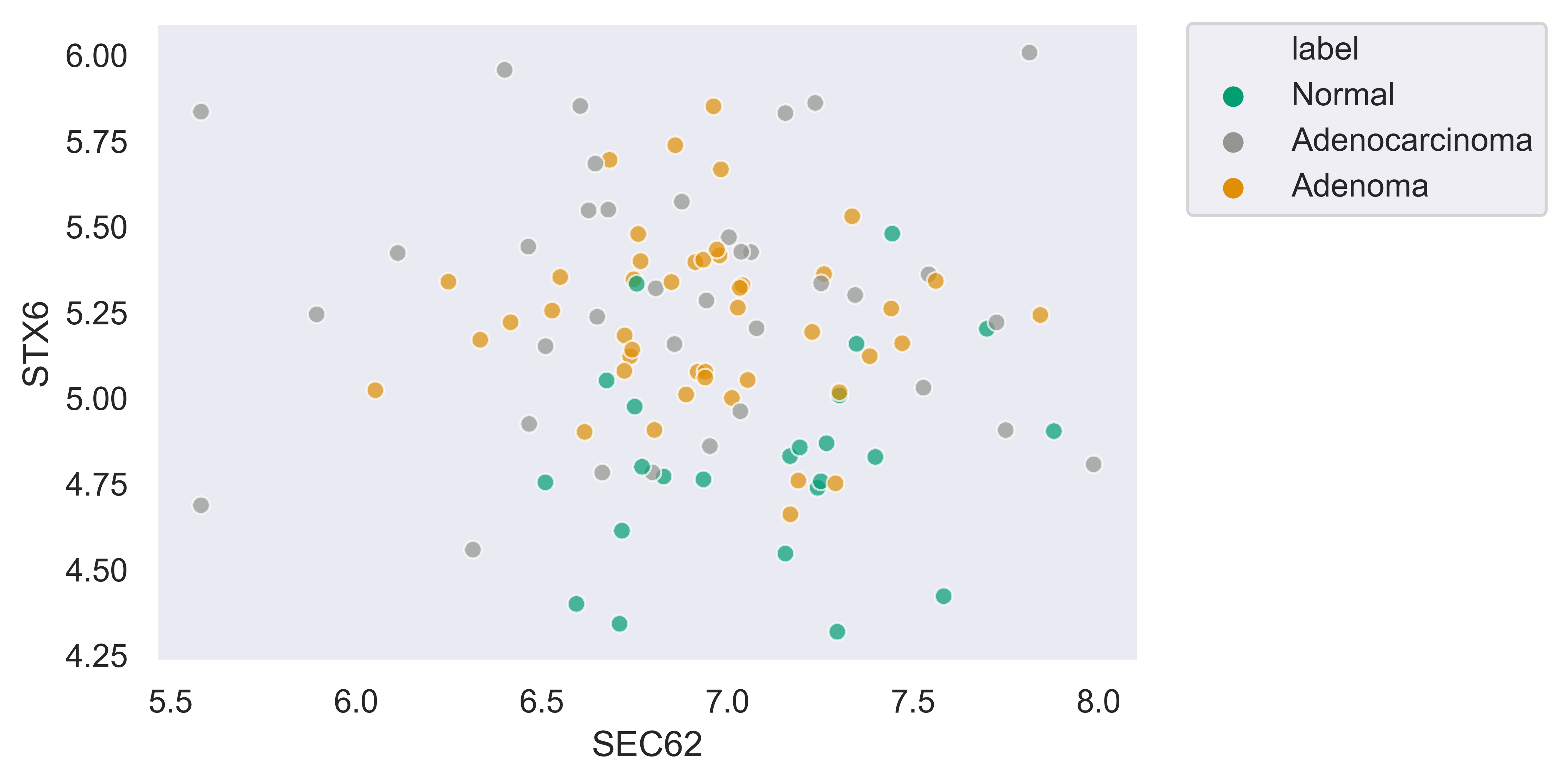
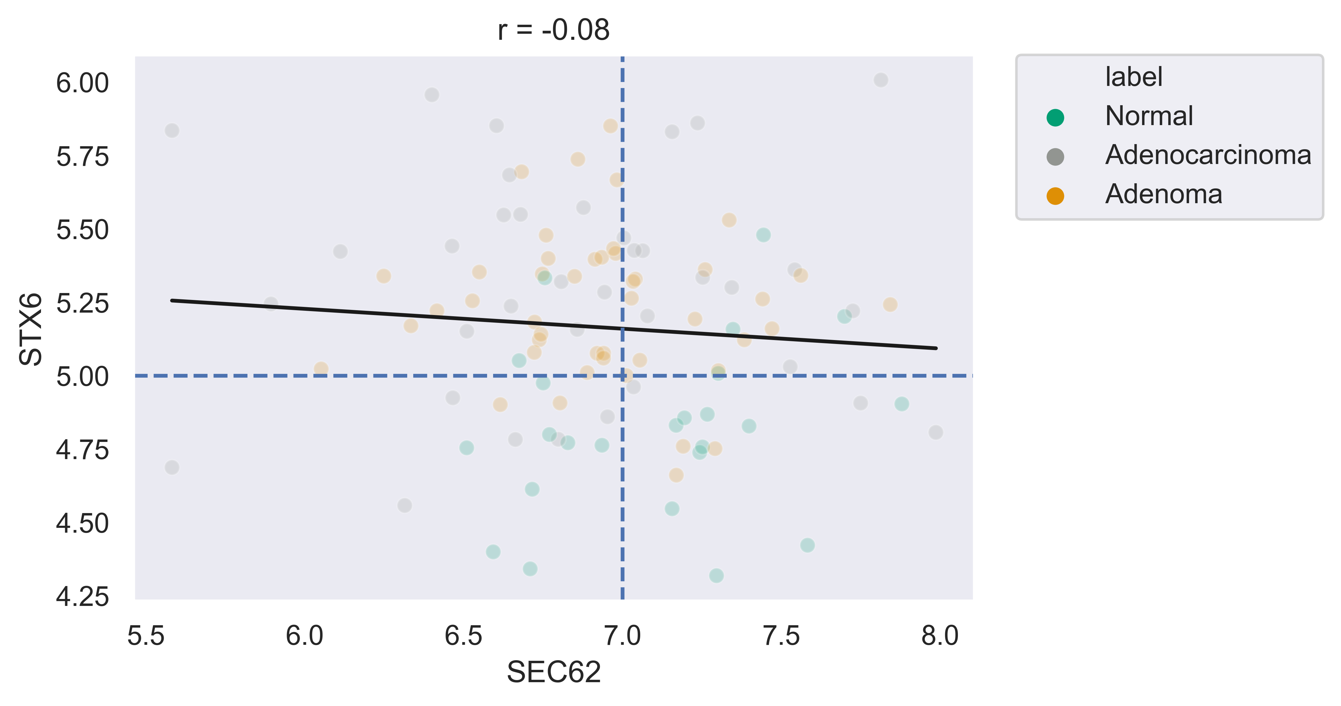
Scatterplot
xpressplot.scatter ( data, info, x, y, palette=None, add_linreg=False, order_legend=None, title=None, alpha=1, highlight_points=None, highlight_color=’DarkRed’, highlight_names=None, alpha_highlights=1, size=30, y_threshold=None, x_threshold=None, threshold_color=’b’, label_points=None, grid=False, whitegrid=False, save_fig=None, dpi=600, bbox_inches=’tight’ )
Purpose:
Create scatterplot with the option to include a linear least-squares regression fit of the data
Assumptions:
- Dataframe and metadata are properly formatted for use with xpressplot
Parameters:
data: xpressplot-formatted dataframe (Required)
info: xpressplot formatted sample info dataframe (Required)
x: X-axis gene or other metric (Required)
y: Y-axis gene or other metric (Required)
palette: Dictionary of matplotlib compatible colors for samples (Default: None)
add_linreg: Add a linear least-squares regression line (default: False)
order_legend: List of experiment groups in order to display on legend (Default: None)
title: Plot title (default: None)
alpha: Opacity percentage for scatter plot
highlight_points: List of indices to highlight on scatterplot (if desired to plot multiple sets in different colors, lists of lists can be provided)
highlight_color: Color or ordered list of colors to plot highlighted points (if multiple lists are being highlighted, pass colors in same order as a list)
highlight_names: Ordered list of names to use in legend (must follow order provided for highlight_points and highlight_color)
alpha_highlights: Opacity percentage for highlighted elements of scatter plot
size: Marker size
y_threshold: Include a y-axis threshold dotted line (default: None). If a list is provided, each will be plotted
x_threshold: Include a x-axis threshold dotted line (default: None). If a list is provided, each will be plotted
threshold_color: Threshold line color (default: ‘b’; black)
label_points: A dictionary where keys are labels and values are a two-element list as [x-coordinate, y-coordinate]
grid: Set to True to add gridlines (default: False)
whitegrid: Set to True to create white background in figure (default: Grey-scale)
save_fig: Full file path, name, and extension for file output (default: None)
dpi: Set DPI for figure output (default: 600)
bbox_inches: Matplotlib bbox_inches argument (default: ‘tight’; useful for saving images and preventing text cut-off)
Examples:
>>> xp.scatter(data, metadata, 'SEC62', 'STX6', palette=geo_colors, add_linreg=True,
    order_legend=[1,3,2], alpha=.7)
>>> xp.scatter(data, metadata, 'SEC62', 'STX6', palette=geo_colors, add_linreg=False, alpha=.7)
>>> xp.scatter(data, metadata, 'SEC62', 'STX6', palette=geo_colors, add_linreg=True, alpha=.2,
    title='this is a title', y_threshold=5, x_threshold=[7])
RNA Volcano Plot
xpressplot.rna_volcano ( file, order_legend=None, title=None, alpha=1, highlight_points=None, highlight_color=’DarkRed’, highlight_names=None, alpha_highlights=1, size=30, highlight_size=30, y_threshold=None, x_threshold=None, threshold_color=’b’, label_points=None, grid=False, whitegrid=False, interactive=False, save_fig=None, dpi=600, bbox_inches=’tight’ )
Purpose:
Create volcano plot with non-normally distributed data (RNA-seq). See
Volcano Plot for examples.Assumptions:
- file is a DESeq2-output table
- Note: Many of the options will be non-functional when using interactive mode
file: Path and file name to DESeq2-output table
order_legend: List of experiment groups in order to display on legend (Default: None)
title: Plot title (default: None)
alpha: Opacity percentage for scatter plot
highlight_points: List of indices to highlight on scatterplot (if desired to plot multiple sets in different colors, lists of lists can be provided)
highlight_color: Color or ordered list of colors to plot highlighted points (if multiple lists are being highlighted, pass colors in same order as a list)
highlight_names: Ordered list of names to use in legend (must follow order provided for highlight_points and highlight_color). Must use if highlighting points.
alpha_highlights: Opacity percentage for highlighted elements of scatter plot
size: Marker size
highlight_size: Highlighted marker size
y_threshold: Include a y-axis threshold dotted line (default: None). If a list is provided, each will be plotted
x_threshold: Include a x-axis threshold dotted line (default: None). If a list is provided, each will be plotted
threshold_color: Threshold line color (default: ‘b’; black)
label_points: A dictionary where keys are labels and values are a two-element list as [x-coordinate, y-coordinate]
grid: Set to True to add gridlines (default: False)
whitegrid: Set to True to create white background in figure (default: Grey-scale)
figsize: Set figure size dimensions
interactive: Set as True to create interactive scatter plot (if using this option and saving the output, be sure to include a
html suffix in the file name)save_fig: Full file path, name, and extension for file output (default: None)
dpi: Set DPI for figure output (default: 600)
bbox_inches: Matplotlib bbox_inches argument (default: ‘tight’; useful for saving images and preventing text cut-off)
Volcano Plot
xpressplot.volcano ( data, info, label_comp, label_base, order_legend=None, title=None, alpha=1, highlight_points=None, highlight_color=’DarkRed’, highlight_names=None, alpha_highlights=1, size=30, y_threshold=None, x_threshold=None, threshold_color=’b’, save_threshold_hits=None, save_threshold_hits_delimiter=’,’, label_points=None, grid=False, whitegrid=False, return_data=False, figsize=(10,10), interactive=False, save_fig=None, dpi=600, bbox_inches=’tight’ )
Purpose:
Create volcano plot with normally distributed data
Assumptions:
- Dataframe and metadata are properly formatted for use with xpressplot
- Note: Many of the options will be non-functional when using interactive mode
Parameters:
data: xpressplot-formatted dataframe, sample normalized (Required)
info: xpressplot formatted sample info dataframe (Required)
label_comp: Experiment group name to act as comparison group (Required)
label_base: Experiment group name to act as base group (Required)
order_legend: List of experiment groups in order to display on legend (Default: None)
title: Plot title (default: None)
alpha: Opacity percentage for scatter plot
highlight_points: List of indices to highlight on scatterplot (if desired to plot multiple sets in different colors, lists of lists can be provided)
highlight_color: Color or ordered list of colors to plot highlighted points (if multiple lists are being highlighted, pass colors in same order as a list)
highlight_names: Ordered list of names to use in legend (must follow order provided for highlight_points and highlight_color). Must use if highlighting points.
alpha_highlights: Opacity percentage for highlighted elements of scatter plot
size: Marker size
y_threshold: Include a y-axis threshold dotted line (default: None). If a list is provided, each will be plotted
x_threshold: Include a x-axis threshold dotted line (default: None). If a list is provided, each will be plotted
threshold_color: Threshold line color (default: ‘b’; black)
save_threshold_hits: Include path and filename to save points out of bounds of the threshold points (greater than the Y-threshold, and outside of the X-threshold range)
save_threshold_hits_delimiter: Delimiter to use for saving threshold hits (default: ‘,’; .csv)
label_points: A dictionary where keys are labels and values are a two-element list as [x-coordinate, y-coordinate]
grid: Set to True to add gridlines (default: False)
whitegrid: Set to True to create white background in figure (default: Grey-scale)
return_data: Set as True to return dataframe with log2 Fold Changes and -log10 P-values added
figsize: Set figure size dimensions
interactive: Set as True to create interactive scatter plot (if using this option and saving the output, be sure to include a
html suffix in the file name)save_fig: Full file path, name, and extension for file output (default: None)
dpi: Set DPI for figure output (default: 600)
bbox_inches: Matplotlib bbox_inches argument (default: ‘tight’; useful for saving images and preventing text cut-off)
Examples:
>>> xp.volcano(data, metadata, 'Adenoma', 'Normal', highlight_points=['STX6','SCARB1','CCL5'])
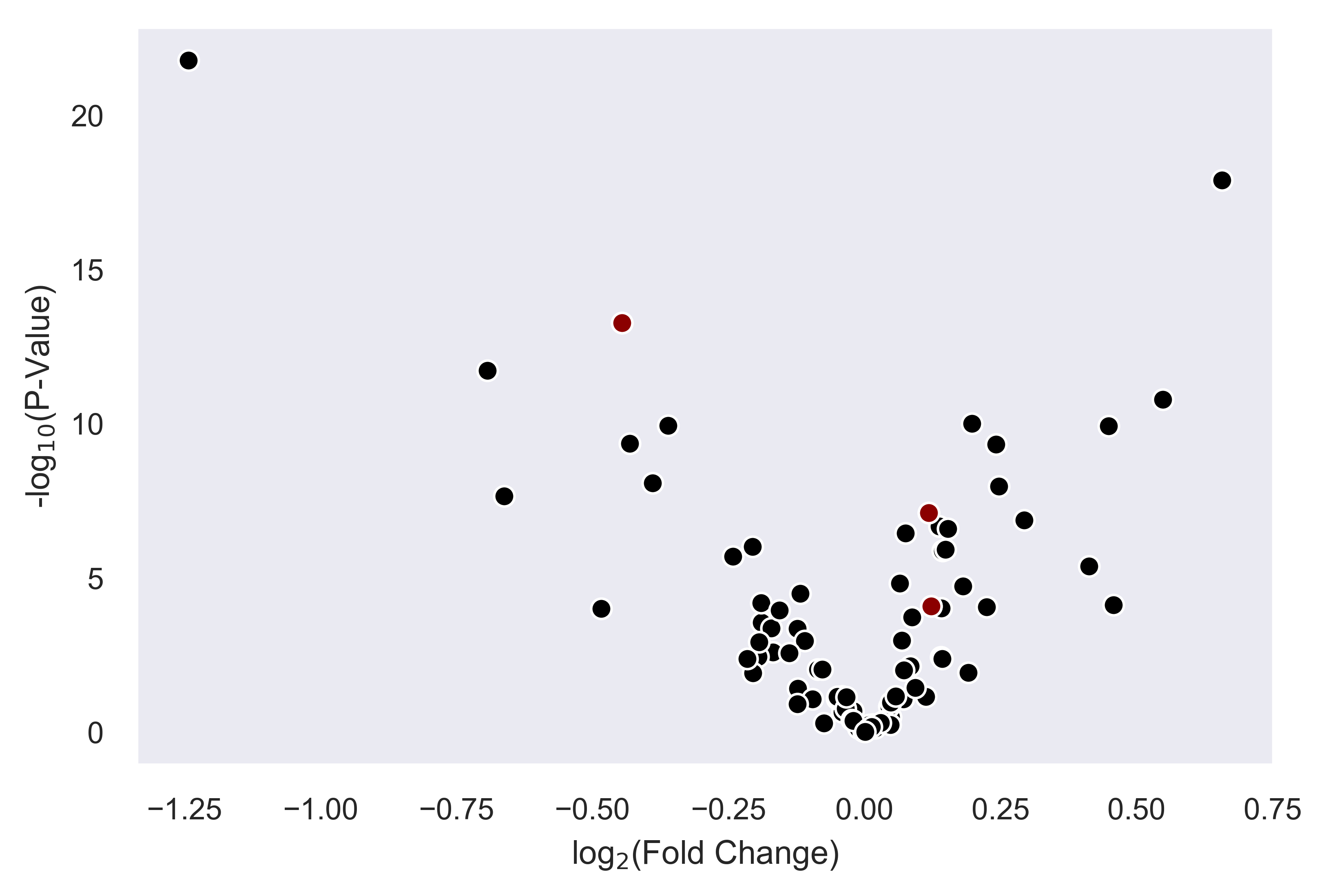
>>> xp.volcano(data, metadata, 'Adenoma', 'Normal', highlight_points=['STX6','SCARB1','CCL5'],
    y_threshold=2, x_threshold=[-1,1], save_threshold_hits=save_threshold)
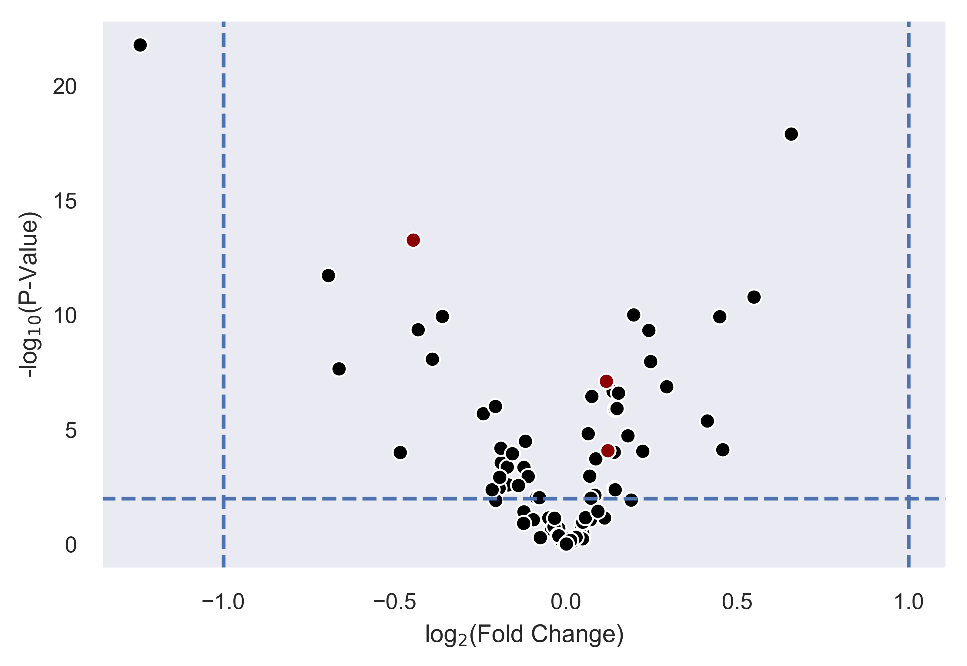
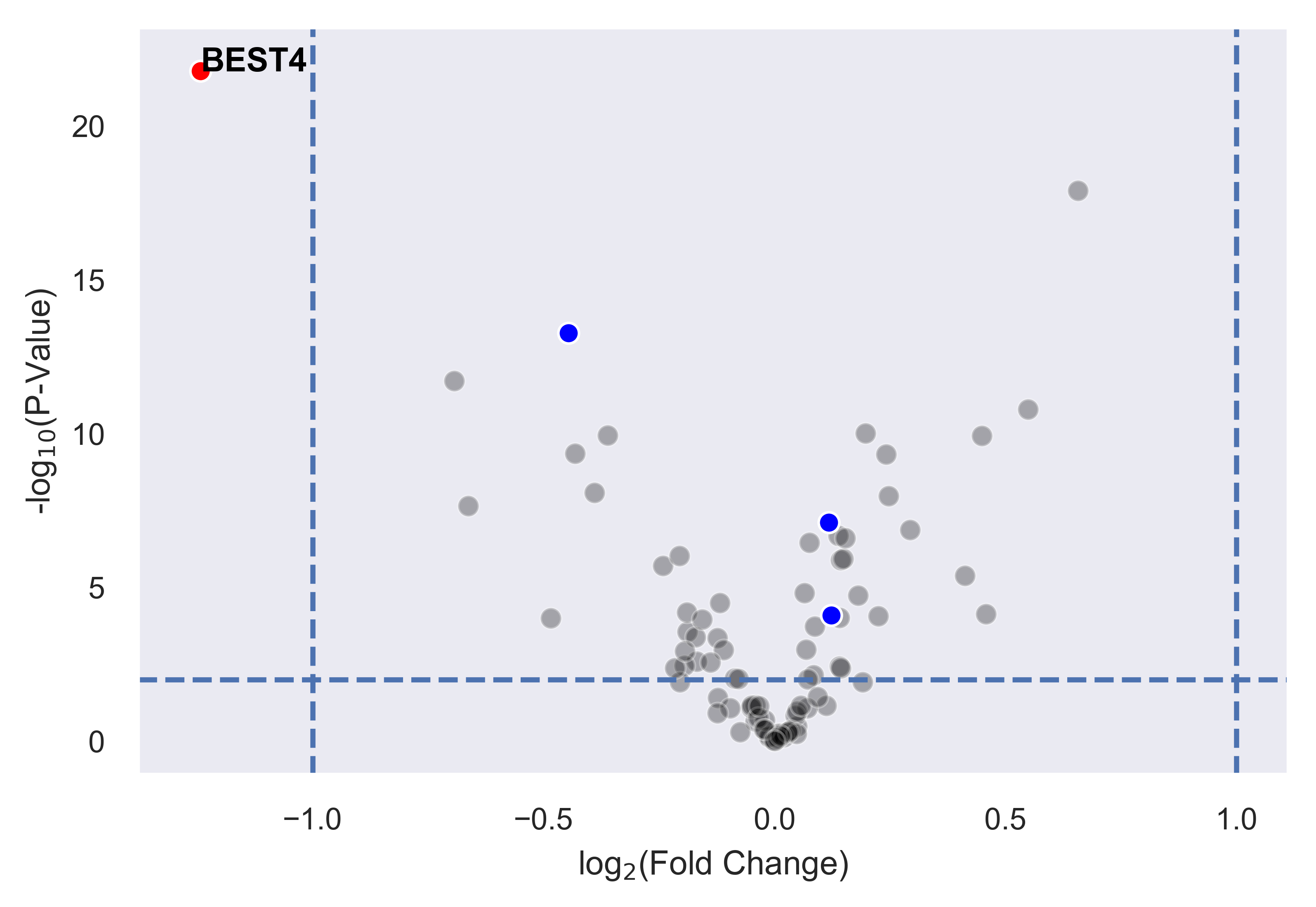
>>> xp.volcano(data, metadata, 'Adenoma', 'Normal', highlight_points=[['STX6','SCARB1','CCL5'],['BEST4']],
    highlight_color=['blue','red'], alpha=.3, y_threshold=2, x_threshold=[-1,1],
    label_points={'BEST4':[-1.24288077425345,21.782377963035827]})
Linear Regression
xpressplot.linreg ( data, gene_name, save_file, delimiter=’,’ )
Purpose:
Calculate r, r^2 values, and p-values for every gene against target gene for given dataset
Assumptions:
- Dataframe is properly formatted for use with xpressplot
Parameters:
data: xpressplot-formatted dataframe, sample normalized (Required)
gene_name: Target gene name to run genome-wide comparisons against
save_file: Full file path, name, and extension for file output (default: None)
delimiter: Field separator for output file (default: ‘,’)
Examples:
>>> xp.linreg(data, 'STX6', 'path/to/output.csv', delimiter=',')
Jointplot
xpressplot.jointplot ( data, info, x, y, kind=’reg’, palette=None, order=None, title_pad=0, title_pos=’right’, grid=False, whitegrid=False, save_fig=None, dpi=600, bbox_inches=’tight’ )
Purpose:
Create linear regression scatterplot that displays r value, confidence, and density distributions for axes
Assumptions:
- Dataframe and metadata are properly formatted for use with xpressplot
Parameters:
data: xpressplot-formatted dataframe (Required)
info: xpressplot formatted sample info dataframe (Required)
x: X-axis gene or other metric (Required)
y: Y-axis gene or other metric (Required)
kind: Type of plot to create from the seaborns jointplot function (default: ‘reg’; linear regression)
palette: Dictionary of matplotlib compatible colors for samples (Default: None)
order: List of experiment groups in order to display on legend (Default: None)
title_pad: Amount of padding to give title from default position (default: 0)
title_pos: Title position (default: ‘right’; other options: ‘center’, ‘left’)
grid: Set to True to add gridlines (default: False)
whitegrid: Set to True to create white background in figure (default: Grey-scale)
save_fig: Full file path, name, and extension for file output (default: None)
dpi: Set DPI for figure output (default: 600)
bbox_inches: Matplotlib bbox_inches argument (default: ‘tight’; useful for saving images and preventing text cut-off)
Examples:
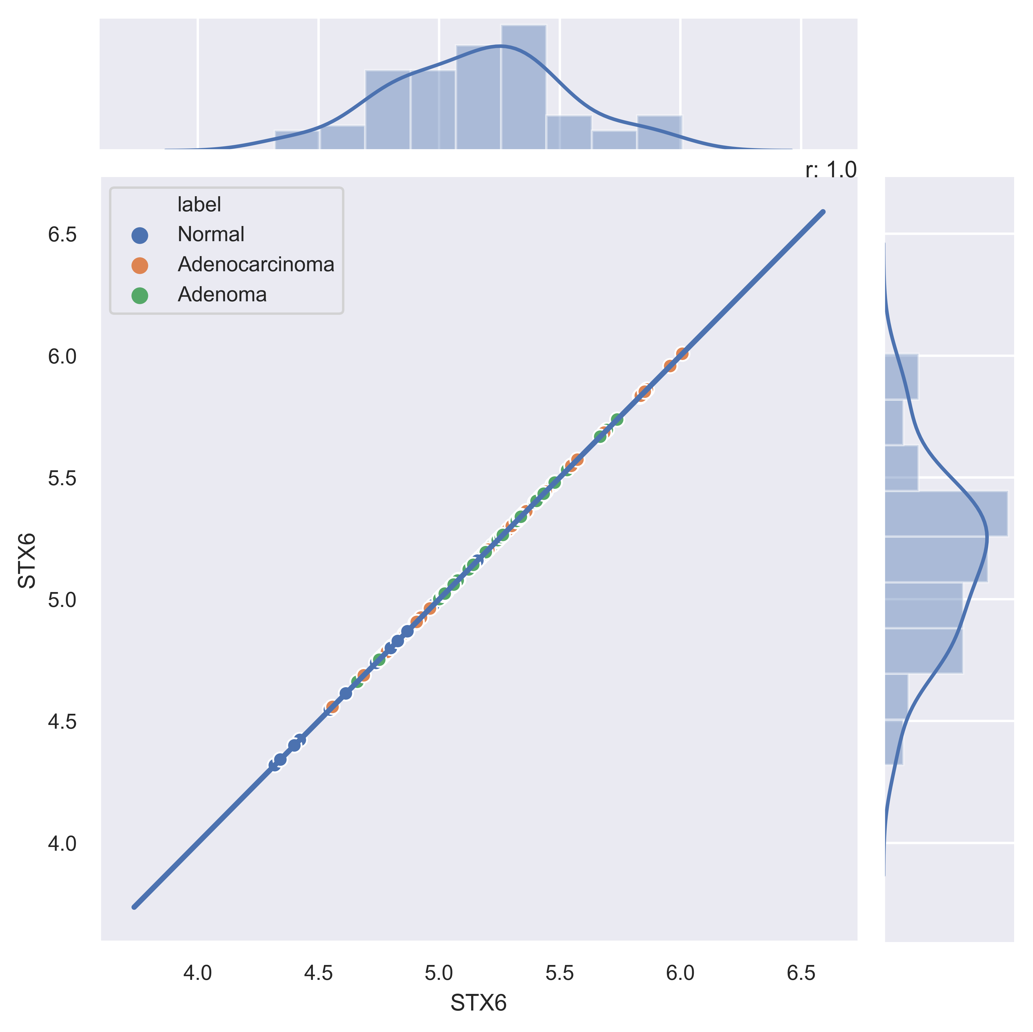
>>> xp.jointplot(geo_labeled, meta, 'STX6', 'STX6', kind='reg')
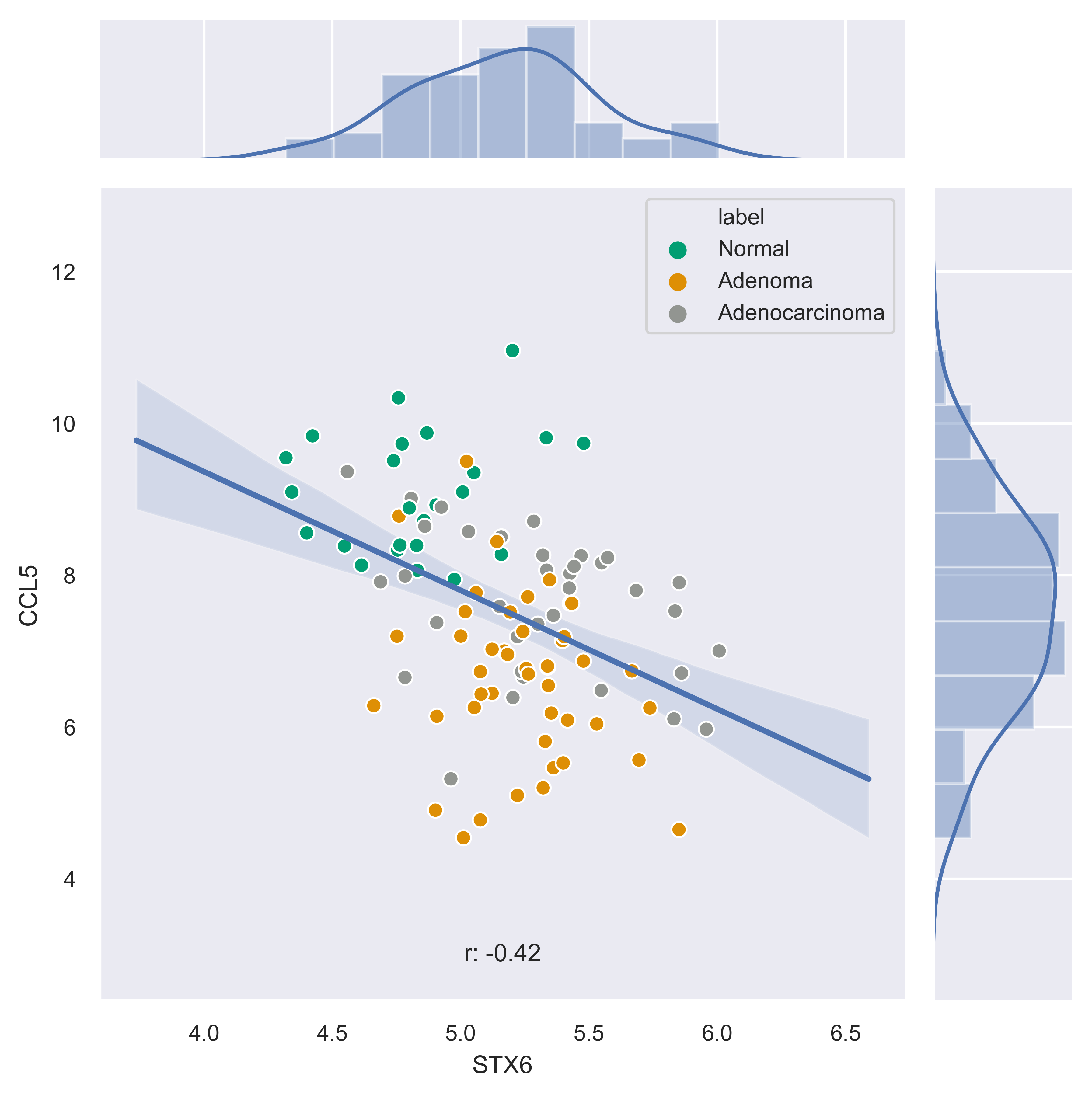
>>> xp.jointplot(geo_labeled, meta, 'STX6', 'CCL5', kind='reg', palette=geo_colors,
    order=['Normal','Adenoma','Adenocarcinoma'], title_pad=-305, title_pos='center')
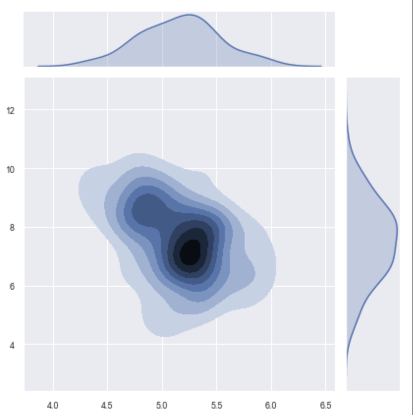
>>> xp.jointplot(geo_labeled, meta, 'STX6', 'CCL5', kind='kde', palette=geo_colors,
    order=['Normal','Adenoma','Adenocarcinoma'])
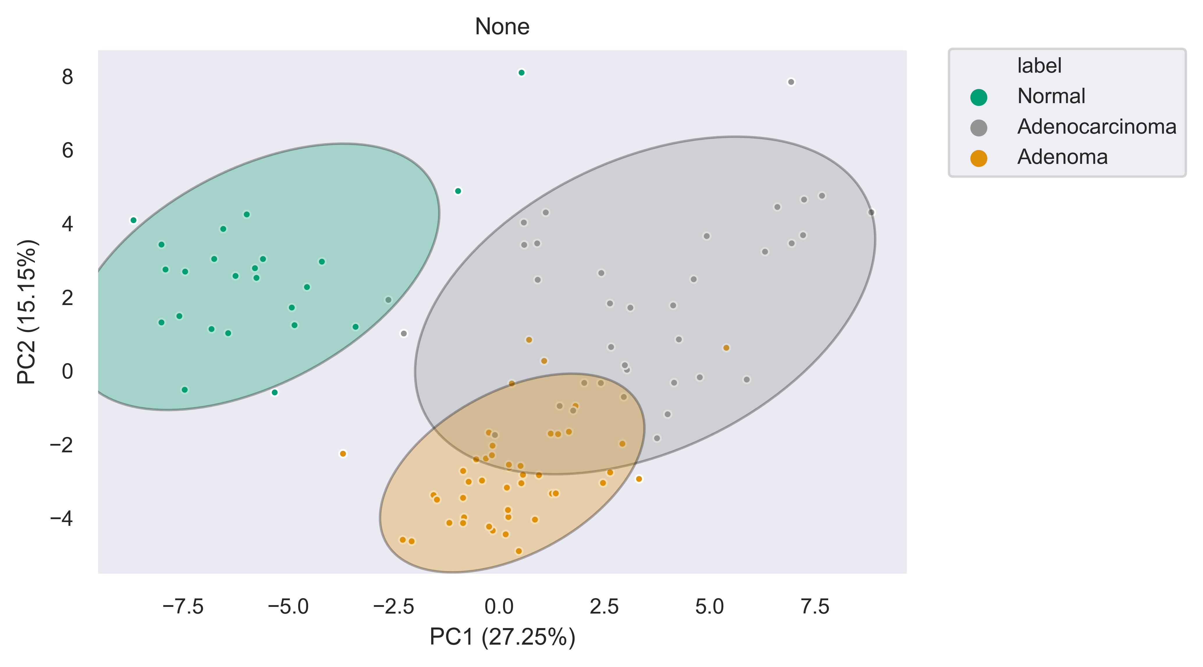
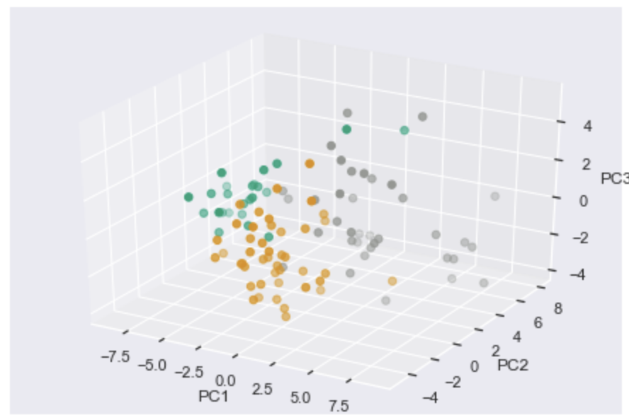
PCA (2-D, 3-D, Interactive)
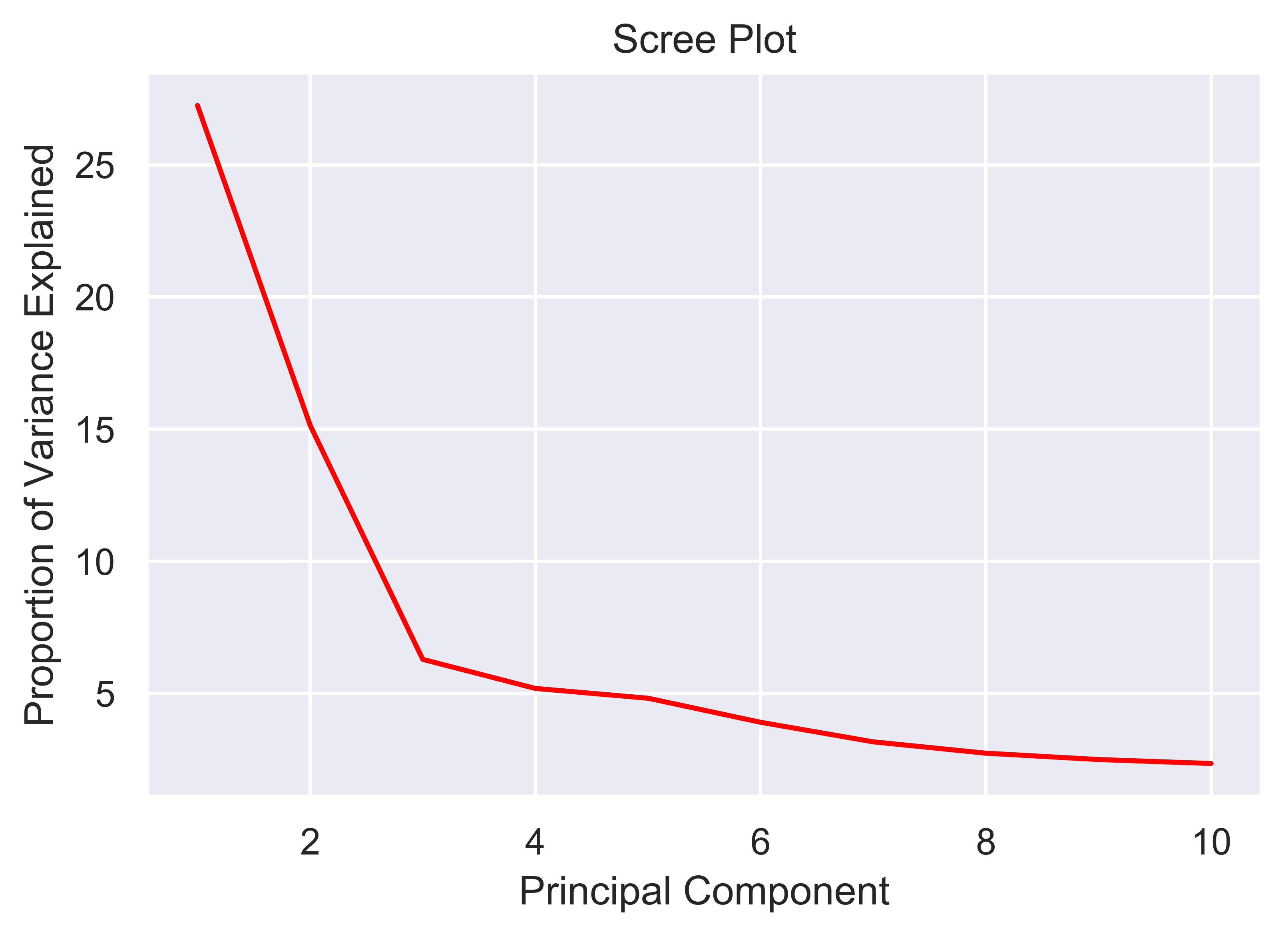
xpressplot.pca ( data, info, palette, grouping=’samples’, gene_list=None, gene_labels=False, _3d_pca=False, principle_components=[1,2], n_components=10, ci=2, scree_only=False, save_scree=False, size=30, order_legend=None, title=None, fig_size=(10,10), grid=False, whitegrid=False, save_fig=None, dpi=600, bbox_inches=’tight’, return_pca=False, plotly_login=None )
Purpose:
Plot a 2-D PCA with confidence intervals or a 3-D PCA with no confidence intervals
Assumptions:
- Dataframe and metadata are properly formatted for use with xpressplot
Parameters:
data: xpressplot-formatted dataframe, sample normalized (Required)
info: xpressplot formatted sample info dataframe (Required)
palette: Dictionary of matplotlib compatible colors for samples (Default: None)
grouping: What axis of the data to perform the analysis (default: ‘samples’ or columns; other options: ‘genes’, not yet implemented)
gene_list: List of genes to perform PCA across
gene_labels: Option for grouping=’genes’, not currently implemented
_3d_pca: Set to True to create 3-D PCA plotting principle components 1-3 (default: False)
principle_components: List of principle components to plot for 2-D PCA
n_components: Number of components to evaluate in the general analysis
ci: Confidence intervals to plot (i.e. 1 == CI1 == 68%, 2 == CI2 == 95%, 3 == CI3 == 99%)
scree_only: Only evaluate scree plot for n_components and exit
save_scree: Output scree plot to path and filename (automatically appends ‘_scree.pdf’)
size: Marker size
order_legend: List of experiment groups in order to display on legend (Default: None)
title: Plot title (default: None)
fig_size: Figure size tuple; width, height (default: (16,6.5))
grid: Set to True to add gridlines (default: False)
whitegrid: Set to True to create white background in figure (default: Grey-scale)
save_fig: Full file path, name, and extension for file output (default: None)
dpi: Set DPI for figure output (default: 600)
bbox_inches: Matplotlib bbox_inches argument (default: ‘tight’; useful for saving images and preventing text cut-off)
return_pca: Set as True to return dataframe with principle component values added
plotly_login: Include plotly login username and password to create an interactive plot, ex: [‘username’,’password’] – not yet implemented
Notes:
- Exporting 3-D static PCA plots is not currently supported
Examples:
>>> xp.pca(geo_labeled, meta, geo_colors, grouping='samples', gene_list=None, gene_labels=False,
    ci=2, principle_components=[1,2], n_components=10, _3d_pca=False, scree_only=False,
    save_scree=None, size=10)
>>> xp.pca(geo_labeled, meta, geo_colors, _3d_pca=True, order_legend=[1,3,2], save_fig=pca_file)
>>> xp.pca(geo_labeled, meta, geo_colors, _3d_pca=False, scree_only=True, save_scree=True)